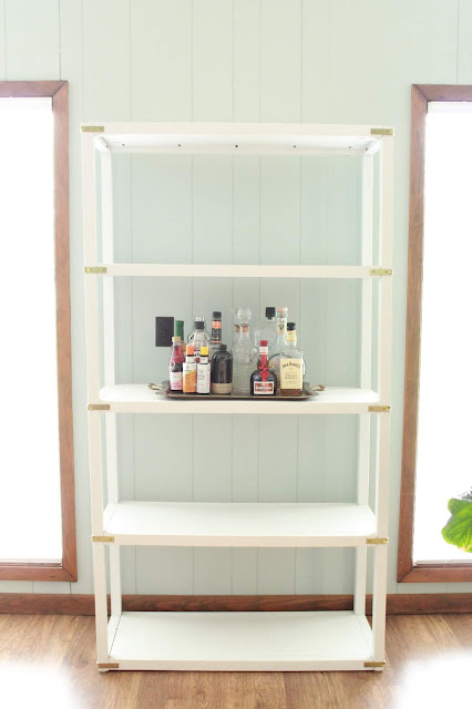
Happy Saturday Peeps! I'm back with a second bookshelf look and something tells me that you guys may enjoy this one just a tiny bit more than the first! Two words: mini bar!
1. Always include books. That's their whole purpose.
2. Consider the room: This will likely help with its function. (example: If you're big on entertaining, in a living or dining room, you may need a couple shelves for a bar and bar wares.)
3. Aim for a cohesive color scheme. Since its such a concentrated space, make sure all of the colors and textures play well together; otherwise, you just have a visual mess on your hands.
4. Depending on the width of your shelves, try to display only 1-3 vignettes on each shelf. If your shelves are longer than 40" wide, you can go for more.
BONUS: Utilize all the height your can! That top shelf is prime real estate for more decor and that final touch!
I started by emptying the shelf so that I was starting with a clean slate!
I knew I was going to incorporate a bar, so I wanted to ground it with a tray.
Next, all the bar basics: liquor, mixes and bitters.
Next, all the bar necessities: glassware, bar tools and garnishes.
Since the bar shelf was pretty heavy, I wanted adjacent shelves to feel as light as possible. For the upper shelf, one solitary plant in an elevated planter fit the bill perfectly.
Remember, the bottom shelf of bookcases are probably the most utilitarian. They're great for housing boxes that corall the not-so-pretty items. Things like board games, kids toys, mailing supplies, magazines, etc.
I wanted to fill in the third shelf with a set of three vignettes. Two of the three started with a foundation of coffee table books.
I topped them with a stack of bone inlay boxes and a vase with a large faux monstera leaf and finished the third vignette with an articulated wooden mannequin.
Finally, that bonus tip I mentioned earlier: taking advantage of all that height and addressing the top shelf. I hung a piece of art on the wall just a couple inches above the bookshelf and then layered a second piece by leaning it in front of the original.
The light that hits the top shelf is a plant's dream so, of course, I added one (one real, one faux) to finish it off and complete the entire look.
I can't quite put my finger on why, but look 2 is definitely my fav. Maybe it's the simplicity of the overall color story. Then you get your pop of color and "excitement" from the plants and all the fun in the mini bar.Whatever it is, I kinda want to pat myself on the back for this one. The detail shots make me even happier!
I'd love to hear your thoughts! How would you compare look 1 to look 2. Do you have a preference? Let me know by leaving a comment below. But first, check out the gif I made for you!


activate avg license number
ReplyDeletehow to activate avg internet security
avg internet security product key
avg mobile antivirus activation code
avg antivirus free activation code
Matliving
ReplyDeleteMatliving
Matliving
Matliving
I discovered your blog through the Ryanair Discount Code, and I’m thrilled to have found such helpful and creative ideas.
ReplyDelete